MOBILE APP
pReTravel
A one-stop-shop app for travel planning after the pandemic.
TIMELINE
3 Weeks, from research to low-fidelity prototype.
GOAL
I designed a high-fidelity prototype of an app for users to research activities and vistas at potential destinations, with an emphasis on holistic information - both related to the pandemic, and general travel information - to permit flexible planning..
MY ROLE & RESPONSIBILITIES
- User Research
- Definition
- Ideation
- UI Design
- Wireframing
- Prototyping
- User Testing
The assignment for this project was rather simple: design an app for travel after the pandemic.
I spent a good deal of time on the research, definition and ideation, though I also built prototypes up to hi-fi.
My Proto Persona started out very basic, with assumptions I made about my target user (a relatively young, modern traveler).
This was the first proto persona I'd ever made, and I think it shows...
Through my research, I found that I wasn't that far off on my assumptions.
You can see the full transcripts of my interviews here, but some of the notable quotes include:
“I stick to gross plans, but specific activities tend to be more spontaneous and flexible”
“I do a decent amount of research; I like just showing up at a place and just figuring it out when I'm there, but it's also nice to have an idea of what to do when you arrive.”
“I would enjoy light planning over a long period of time, as more of an escapist activity”
Many of the interviewees also expressed desires for more authentic and localized experiences, rather than tourist traps.
Thanks to the number of questions I asked, I ended up with a pretty sizeable Affinity Diagram, which you can see in full on my Miro Board, but here are some examples:
I summarized many of these insights into an Empathy Map
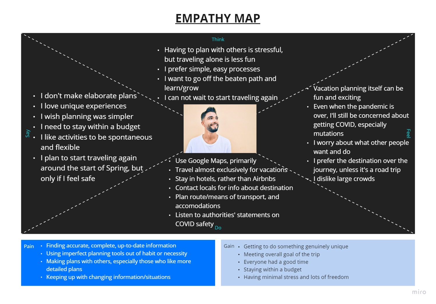
Thanks to all that user research, I ended up with a more polished User Persona:
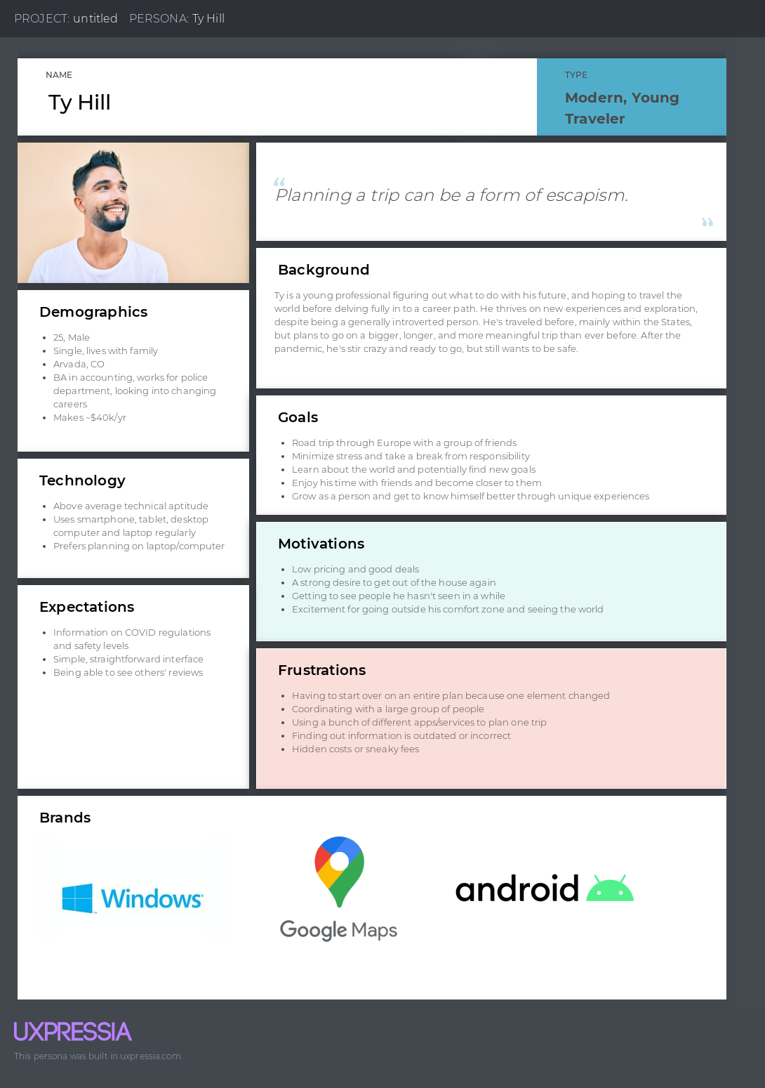
He got a name change and a haircut, too.
Users weren't the only thing I researched, though. I also took a look at a few competitors, chosen from the commonly used tools my interviewees mentioned.
I annotated screenshots in an Adobe Xd Document
As well as an onboarding SWOT Analysis in Google Sheets
From my research, I landed on the following User Statement and Problem Statement. You may notice these are different from the images in the above carousel - this is because I removed the parts about the "means of travel" and the "journey itself" to limit scope creep, given the time limit.
Ty, a modern traveler needs highly accurate, up-to-date, and easily-accessible travel information, because he wants to have spontaneous, deeply meaningful and unique experiences with his travel companions, while still maintaining his safety and peace of mind.
Modern travelers need a reliable and complete source of accurate, up-to-date information to make their travel as carefree as possible, while minimizing planning and research time, helping give them a safe, but meaningful travel experience.
If you're really curious, you can see my previous iterations here
To help with my ideation I used two types of matrices:
I like, I Wish, What If
How, Now, Wow
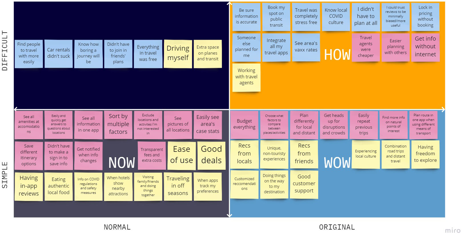
All this helped me find my value proposition: a one-stop-shop for flexible travel planning, with minimal pressure, meaning minimal stress.
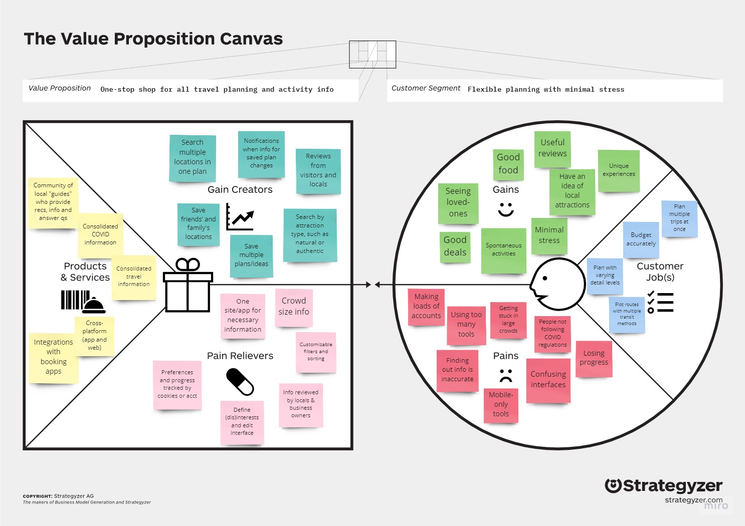
To bring all that back to the user, I made a User Scenario, Storyboard and User Journey Map, to further detail the user experience
Adding to that detail, I built out a narrow User Flow to show what I'd be working on for the Prototype. Below is a snippet, but you can see the whole thing here.
The items with the blue background are part of the Task Flow.
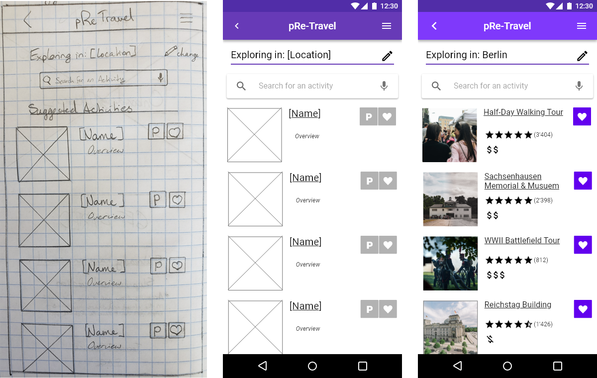
I started out with paper sketches, to get a more visual idea of the flow.
Using those sketches, I made a Paper Prototype in InVision, with very basic functionality.
From there, I upgraded to mid-fi, this time with added screens for adding an activity to a plan.
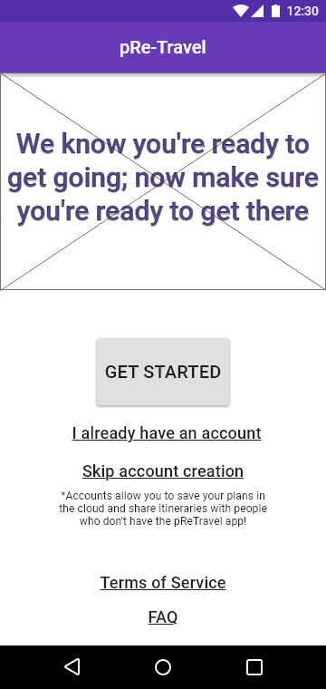
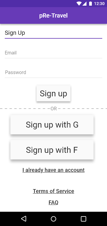
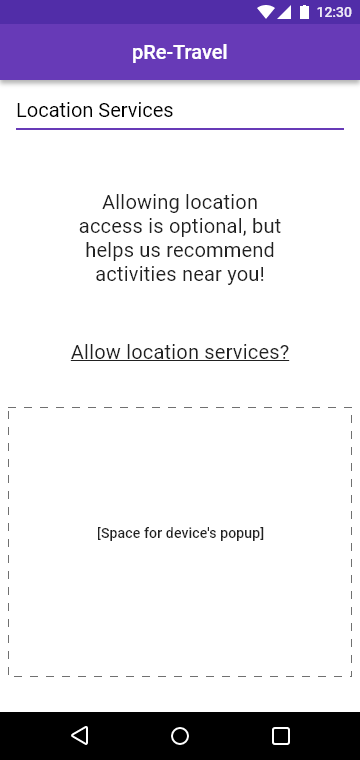
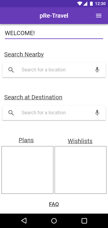
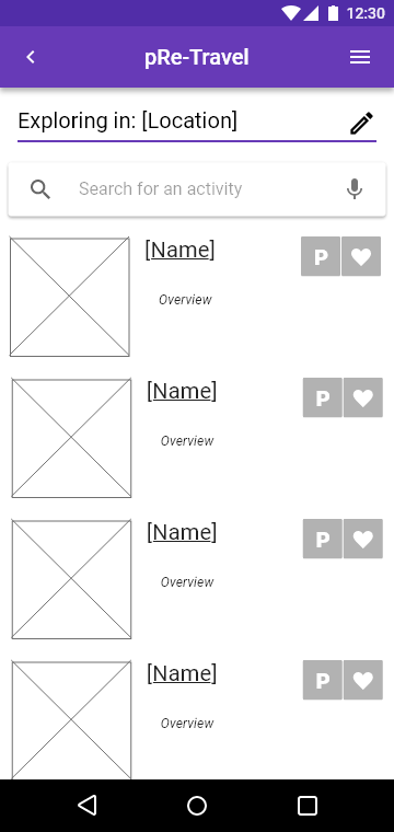
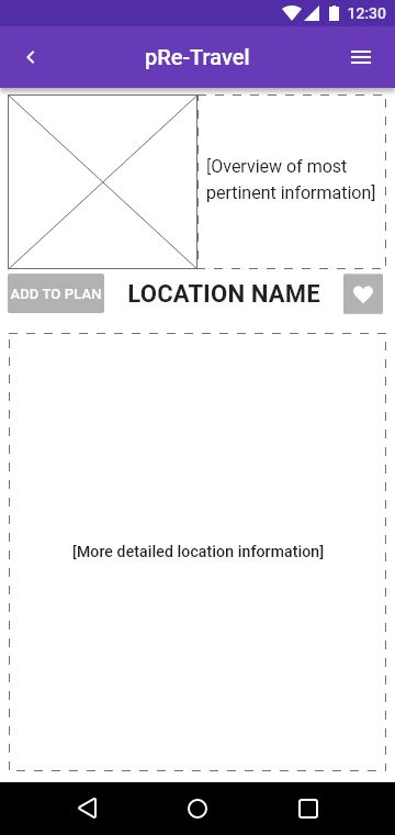
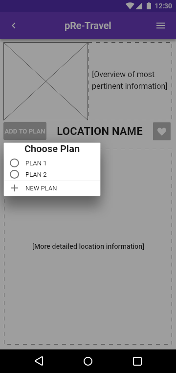
Feel free to click through the Adobe Xd Prototype
With this more fleshed out protoype, I decided to run some guerilla user testing, using a quickly-drafted Testing Plan.
The testers had great insights, though a lot of their frustrations came from the low fidelity, especially confusion with the location
services screen.
One piece of feedback that made a fairly major change to the following iteration was around having both a
button for plans, and a for favorites. Users felt this was redundant and
confusing, leading me to remove the "Plan" feature altogether, in favor of one list type.
Given the amount of confusion around the location services screen, I also opted to add a mockup of an Android location services popup.
Using Material Design components and principles, feedback from my testing, some of my own photography and some content from Expedia (purely for testing purposes), I raised the fidelity of my protoype.
If you want to see it, you'll have to quickly assume the persona of Ty Hill, our young traveler, searching for cultural experiences in Berlin, for that section of his road trip. When he finds the Sachenhausen Memorial & Museum, he adds it to his favorites.
GIVE IT A SHOT